Monograms, symbols and wordmarks, each built around a second meaning — hidden in a letter, cut into negative space or drawn into custom lettering.
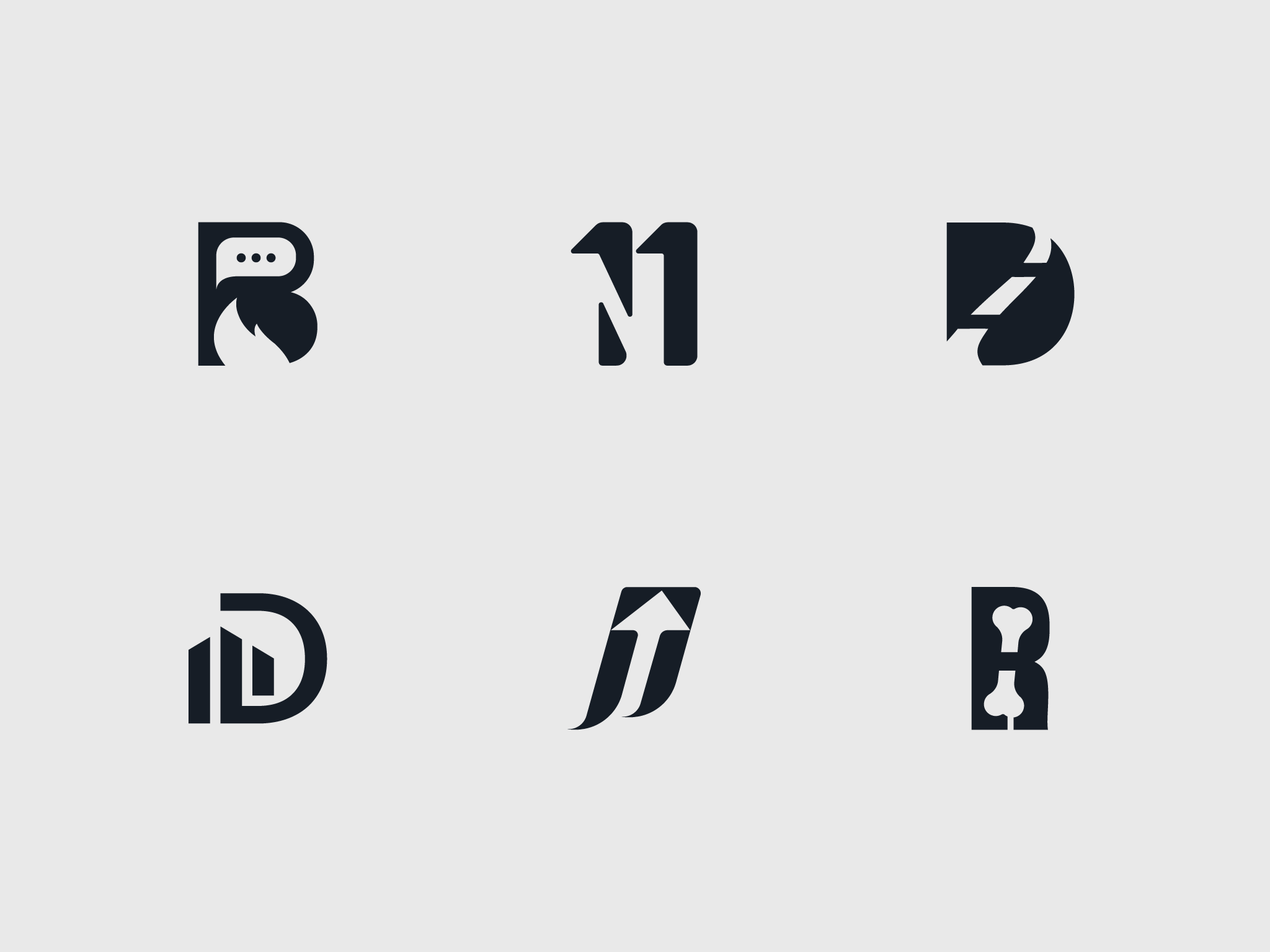
Scroll to exploreThe solid marks use negative space to carry the second idea: a speech bubble and flame cut into an R, a building skyline forming a D, an arrow rising through a J, a bone set inside an R. Each works in a single colour and holds up at small sizes.
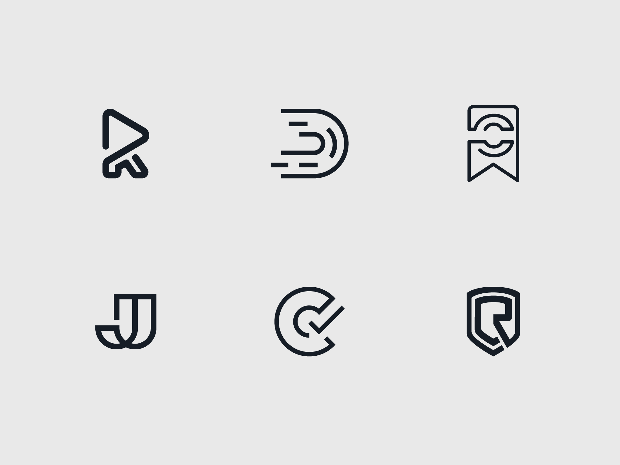
The line marks keep one consistent stroke weight throughout — a play button inside an R, motion lines trailing a D, a bookmark, interlocking Js, a C closing into a checkmark and an R set in a shield.
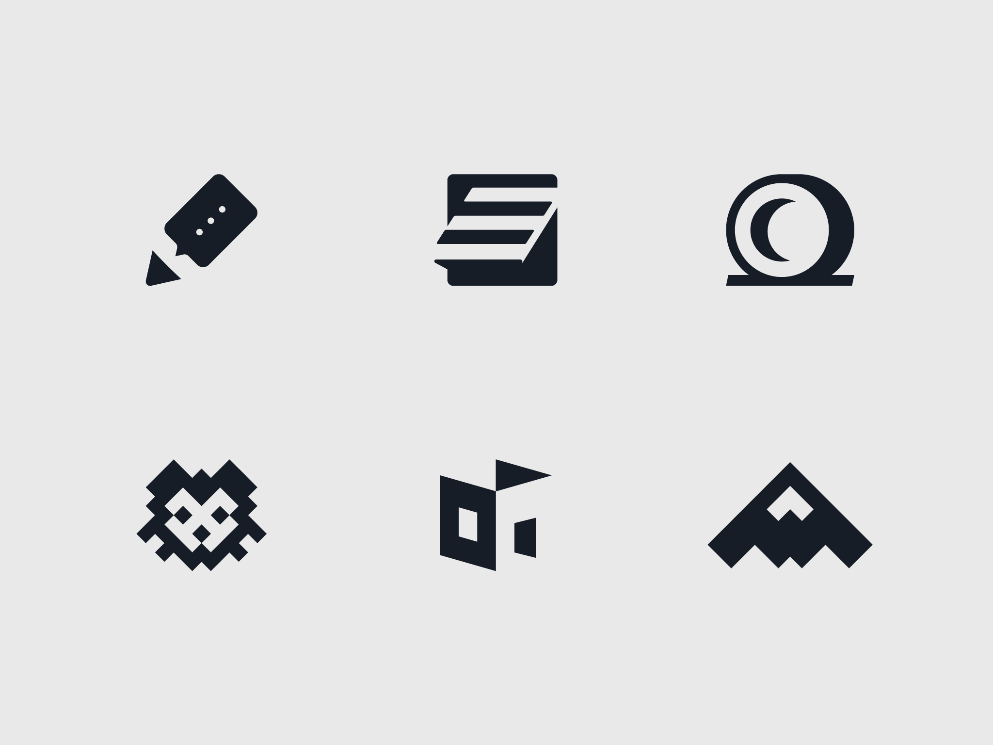
The third set moves past letters into pictorial marks — a pen with a speech bubble, an S stepping into a checkmark, a moon inside an O, a pixel lion, a flag on a building and a mountain peak. Each is reduced to a few solid shapes, and the gaps between them carry as much of the image as the shapes do — the speech bubble, the checkmark and the crescent moon are all cut out rather than drawn. That keeps every mark clear at any size.
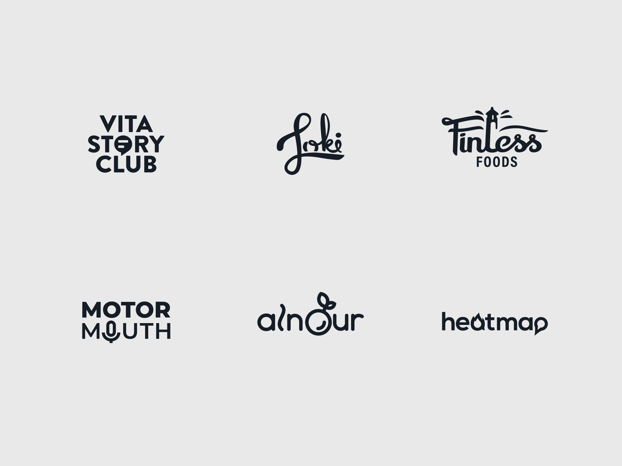
The wordmarks hide a single idea inside the name — a speech bubble in Vita Story Club, a microphone in Motor Mouth, a leaf in alnour, a flame in heatmap and a lighthouse rising from the script of Finless Foods — alongside the hand-lettered Loki. None of them is set in an off-the-shelf font: each is either drawn from scratch or built on an existing typeface that has been customised, with letters reshaped, joined or cut so the name reads as one mark.